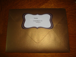
Envelope in Antique Gold
Damn, I love that color
We wanted our invites to reflect our red and gold color scheme. I really liked the idea of having gold envelopes, it's kind of like our guests are getting a golden ticket. We tracked these down at Paper Source along with all the labels and baker's twine. Paper Source = one-stop-shop!
The wrapped invite
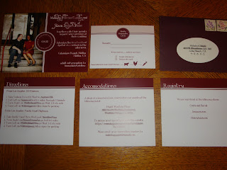
After our guests tear apart the envelope (let's be honest), they will see the whole invite lovingly tied with twine. I haven't seen too many invites that use photos, but we wanted to use one of our engagement photos for a more personal feel. I think it's likely that our guests will hold on to the invite longer if our mugs are on it.
The complete suite
Cow, chicken or carrot?
I put a lot of thought into the RSVP design. I wanted to make it really clear what the guests should do. I'm not gonna lie, the first time I got a wedding invite and I saw the line that looked like this M______, I wrote in Melody. True story. Even though our guests are probably smarter than me, I thought using "Names" was probably a better idea. The cute animal images are completely unnecessary since we're having a buffet. But, I wanted them there for my own amusement.
The whole shebang
The only trouble we had with our invites were spelling errors. Hive, please proofread your invites! And don't just read them on your computer screen, actually print them out and read them through. After we got our proof back from Catprint, I just made sure the photo looked good. MOH J5 found two glaring spelling errors after we had already given Catprint the go ahead to print the finished invites. Unfortunately it was too late and in the end we had to shell out extra money for more invites, sans the spelling errors. It wasn't a huge amount, but it could have been avoided. I should really know how to spell "o'clock" and "share" by now. But, we're happy with the finished product!
Did anyone else have any embarrassing spelling errors on their invites?


good advice about the spell check...but I'm sure it all came out fine. They look greaT!! The gold is amazing, and together with the deep red, it's VERY elegant! I LOVE the color scheme a lot..KUDOS!
ReplyDelete